Power BI
WHAT DOES POWER BI’S “GET DATA” ICON REPRESENT?
Users can select any data source from a drop-down menu that appears when they click the Get Data icon in Power BI. In fact, data can be directly ingested from any source, including databases like SQL, Access, SQL Server Analysis Services, Oracle, IBM, MySQL, and much more as well as files in the Excel, CSV, XML, JSON, PDF, and SharePoint formats. Additionally, Power BI data flows and datasets are compatible. Additionally, data can be retrieved from Azure and other online resources.
IN POWER BI, HOW DO YOU CREATE A GROUP?
The fields you want to group must first be selected, after which you must right-click the field to reveal the context menu. These items will be automatically grouped by Power BI when you choose the Group option from the menu.
WHAT ARE THE STEPS FOR MAPPING GEOGRAPHIC DATA INTO POWER BI REPORTS?
Users of Power BI can visually map geographic data on a global and regional scale using a map chart and a filled map chart.
By integrating with Bing Maps, Power BI can geocode locations to determine their default coordinates.
Users are no longer required to supply longitude and latitude coordinates thanks to this integration.
WHAT IS A DASHBOARD?
The dashboard resembles a single-page canvas on which you can draw and visualise reports produced by data analysis using a variety of elements. To build a story, it uses only the most crucial information from the reports.
The dashboard’s visual components are referred to as Tiles. These tiles from the reports can be pinned to the dashboard. Any element on the dashboard can be clicked to access the report for a specific data set.
IS THERE A WAY TO EXPORT FROM POWER BI TO MICROSOFT EXCEL?
You can export any Power BI dashboard or visual data to Microsoft Excel, yes. Select the ellipses (3 dots) in the top-right corner of any visualisation and then click the icon labelled “Export data” to export your data. You can export your data as a.CSV file. Even better, Excel can save and open the file.
HOW CAN RELATIONSHIPS BE SET UP AND MANAGED IN POWER BI DESKTOP?
Power BI Desktop users can create and manage relationships by:
Choose Manage Relationships > New from the Home tab.
Choose a table from the first table drop-down list in the Create relationship dialogue box.
Choose the column that will be a part of the relationship.
Choose the other table you want in the relationship from the second table drop-down list.
Choose OK after selecting the second column that you want to use.
WHAT FUNCTIONS DO THE KEY ELEMENTS OF THE POWER BI TOOLKIT PERFORM?
You can find, access, and combine information from various sources using Power Query.
A modelling tool called Power Pivot.
Power View is a presentation tool that can be used to make charts, tables, and other things.
Create geospatial representations of your data with the aid of Power Map.
Use natural language to ask questions and receive answe. rs with Power Q&A.
WHAT DO POWER BI TILES DO?
An essential component of the power BI services is tile, which is essentially a picture of the data that can be pinned to the dashboard.
WHAT IS BOOKMARK?
In Power BI, a bookmark enables you to record the configured view of a report page at a particular point in time. This includes the filter and visual state, both of which can be used as a bookmark to quickly return to the report.
Is it possible to combine two distinct information sources into one Power BI dashboard?
Yes, It is possible to combine two distinct information sources into one Power BI dashboard. In your Power Bi account, we can also combine similar reports into a single dashboard.
WHAT DOES “DAX FUNCTION” MEAN?
Dax is a formula expression language that can make use of different visualisations, including Power BI. Because all of the code is contained within a single function, it is also known as a functional language.
WHAT ARE RESPONSIVE SLICERS?
Simply on the report page, we can resize a responsive slicer into different sizes and shapes. Its data has been rescheduled to meet our specifications. The icon shows the capability of visuals in its place when visuals are too small to use. Additionally, this procedure makes great use of the report’s page space.
HOW CAN POWER BI DYNAMIC FILTERING BE DONE?
Through the described actions, the Power BI dynamic filtering was accomplished.
We must send Power BI the comprehensive report once the data setup is complete.
The next step is to publish it to a shared workspace.
Create a filtering link.
Create a DAX-calculated column.
Finally, we can release the overview report.
HOW CAN WE USE POWER BI TO SHAPE OUR DATA?
In Power BI, there are three crucial data-shaping methods.
Deletion of columns and rows from the data table.
Adding an index for the data tables.
Putting a sort order in the values-based data tables of the data.
DEFINE CUSTOM VISUALS IN POWER BI.
Using the custom visualisations library, Power BI lets you create your own visualisations. These visualisations can also be added to reports and dashboards. The visualisations are carefully examined, put to the test, and then saved before being posted. Additionally, decision-makers can find the problems and reach decisions quickly with the aid of customised visuals and reports.
IS IT POSSIBLE TO CREATE MULTIPLE DYNAMIC CONNECTIONS BETWEEN TWO TABLES?
No, more than one dynamic connection between two tables is not feasible.
HOW CAN POWER BI REPORTS BE UPDATED AFTER PUBLISHING?
When we need to update Power BI reports after publishing them in the cloud, we can do so through gateways. The gateway is used to update data when the report is published on Power BI websites.
HOW DOES THE SCHEDULED REFRESH FUNCTION?
We can set up data automation for refreshing on a daily, weekly, or other schedule. When Power BI is not available, we are only allowed to schedule one refresh at a time. We can select the time and frequency using the menu options in the scheduled refresh section.
WHAT ARE THE STEPS IN POWER BI TO HIDE AND UNHIDE A SPECIFIC REPORT?
To hide and unhide a specific report, you have to go to the selection Pane in the menu bar, and press hide/unhide toggle button to bookmark.
WHAT INFORMATION IS REQUIRED TO CREATE A MAP IN POWER MAP?
Power Map is capable of displaying visualisations with a geographic theme. For this reason, some sort of location information is required, such as city, state, country, or latitude and longitude.
ARCHITECTURE & POWER BI BASICS
WHAT ARE THE MAJOR COMPONENTS OF POWER BI?
Power BI Desktop: The development tool for connecting to data, transforming it, and creating reports.
Power BI Service (SaaS): The online cloud platform used to publish, share, and collaborate on reports.
Power BI Mobile: App to view reports on the go.
Power BI Gateway: Bridges the gap between on-premise data and the cloud service.
WHAT IS THE DIFFERENCE BETWEEN A REPORT AND A DASHBOARD?
Report: Multiple pages of visualizations based on a single dataset.
Dashboard: A single-page “canvas” (only in Power BI Service) that pins “tiles” from multiple reports to show high-level KPIs.
EXPLAIN THE “POWER BI WORKFLOW.”
Connect to data → Transform data (Power Query) → Model data (Relationships & DAX) → Visualize (Reports) → Publish (Service) → Share (Dashboards).
WHAT ARE THE THREE VIEWS AVAILABLE IN POWER BI DESKTOP?
Report View: Where you build visuals.
Table View: Where you see the data, calculated columns, and measures.
Model View: Where you manage relationships between tables.
DATA CONNECTIVITY & POWER QUERY (ETL)
WHAT IS POWER QUERY?
The data transformation and preparation engine. It uses a language called M. It allows you to clean, merge, and reshape data before it enters the model.
WHAT IS THE DIFFERENCE BETWEEN “IMPORT” AND “DIRECTQUERY”?
Import: Loads a snapshot of the data into Power BI’s memory (fastest performance, but has a 1GB limit per dataset in Pro).
DirectQuery: Does not store data; it queries the source in real-time. Good for very large datasets or “live” data.
WHAT IS “M” LANGUAGE?
It stands for Data Mashup. It is the functional, case-sensitive language used behind the scenes in Power Query.
EXPLAIN “MERGE” VS. “APPEND” IN POWER QUERY.
Merge: Combines columns from two tables (similar to a SQL JOIN).
Append: Combines rows from two or more tables (similar to a SQL UNION).
WHAT ARE “QUERY PARAMETERS”?
Variables that allow you to change the data source or filter data dynamically without editing the query steps. Useful for switching between “Test” and “Production” databases.
DATA MODELING & RELATIONSHIPS
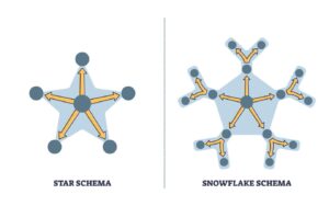
WHAT IS A “STAR SCHEMA” AND WHY IS IT PREFERRED?
A modeling approach where a central Fact Table (containing quantitative data like “Sales” or “Claims”) is surrounded by Dimension Tables (descriptive data like “Date,” “Product,” or “Region”).
Why: It optimizes performance and simplifies DAX calculations.
WHAT IS THE DIFFERENCE BETWEEN A FACT TABLE AND A DIMENSION TABLE?
Fact Table: Contains keys to dimensions and quantitative facts (e.g., Claim Amount, Premium).
Dimension Table: Contains descriptive attributes (e.g., Policyholder Name, Address, Risk Category).
EXPLAIN “CARDINALITY” IN POWER BI.
1:1 (One-to-One): Rare; both tables share unique keys.
1: (One-to-Many): The standard (e.g., one “Customer” can have many “Insurance Policies”).
: (Many-to-Many): Complex; requires careful handling to avoid data ambiguity.
WHAT IS “CROSS-FILTER DIRECTION” (SINGLE VS. BOTH)?
Single: Filtering flows from the Dimension table to the Fact table.
Both (Bi-directional): Filtering flows both ways.
Warning: Use Bi-directional sparingly as it can cause performance issues and circular dependencies.
DAX (DATA ANALYSIS EXPRESSIONS)
WHAT IS DAX?
A formula language used for custom calculations in Power BI. It is similar to Excel but operates on rows and tables.
DIFFERENCE BETWEEN A “CALCULATED COLUMN” AND A “MEASURE”?
Calculated Column: Calculated row-by-row and stored in the data model (increases file size). Use for Slicers/Filters.
Measure: Calculated on the fly based on the user’s filters (does not increase file size). Use for quantitative values (e.g., Total Profit).
EXPLAIN THE CALCULATE FUNCTION.
The most powerful function in DAX. It evaluates an expression in a modified filter context.
Example: CALCULATE(SUM(Sales), Region = “East”).
WHAT ARE “TIME INTELLIGENCE” FUNCTIONS?
Functions that simplify time-based comparisons.
Examples: TOTALYTD (Year-to-Date), SAMEPERIODLASTYEAR, DATEADD.\
Finance Use: Comparing this month’s premium income to the same month last year.
WHAT IS THE DIFFERENCE BETWEEN SUM AND SUMX?
SUM: Aggregates a single column.
SUMX: An “iterator” function. It goes row-by-row, performs a calculation (e.g., Price * Quantity), and then sums the results.
WHAT IS “FILTER CONTEXT” VS. “ROW CONTEXT”?
Row Context: The current row being looked at (used in Calculated Columns).
Filter Context: Any filters applied via slicers, visuals, or DAX (used in Measures).
VISUALIZATIONS & REPORTING
WHAT IS A “SLICER”?
An on-page filter that allows users to interactively narrow down the data shown in other visuals.
WHAT IS “DRILL-THROUGH” IN POWER BI?
A feature that allows a user to click a data point in one report and jump to a detailed page filtered specifically for that data point.
EXPLAIN THE “FORMAT PAINTER.”
Just like in Excel/Word, it copies the visual formatting (colors, fonts, borders) from one chart to another.
WHAT ARE “BOOKMARKS” USED FOR?
They capture the current state of a report page (filters, visibility, slicers). They are often used to create interactive navigation or “Reset Filter” buttons.
WHAT IS A “TOOLTIP” AND HOW DO YOU CUSTOMIZE IT?
A small window that appears when you hover over a data point. You can create a “Report Page Tooltip” to show a mini-chart inside that hover window.
WHAT IS THE “TOP N” FILTER?
A built-in filter to show only the Top (or Bottom) 5 or 10 items based on a specific measure (e.g., Top 10 Brokers by Commission).
ADVANCED CONCEPTS & SECURITY
WHAT IS ROW-LEVEL SECURITY (RLS)?
A security feature that restricts data access for specific users.
Example: A regional manager in India can only see the India data, while the CEO sees everything.
WHAT IS “INCREMENTAL REFRESH”?
Instead of refreshing the entire 10 years of data every day, Power BI only refreshes the newest data (e.g., the last 24 hours), saving time and resources.
WHAT IS THE “POWER BI SERVICE” WORKSPACE?
A shared environment where a team can collaborate on reports and dashboards before sharing them with the wider organization.
WHAT IS A “DATA GATEWAY”?
Software installed on an on-premise server that allows the Power BI Service to “reach in” and refresh data from local SQL databases or Excel files.
HOW DO YOU OPTIMIZE A “SLOW” POWER BI REPORT?
1. Reduce the number of visuals on a page.
2. Use Measures instead of Calculated Columns.
3. Use the Performance Analyzer to find slow queries.
4. Remove unused columns in Power Query to reduce model size.